How to Create a Simple Magazine Template in Adobe InDesign

Ever wanted to create your own magazine or learn more about publishing design? In this tutorial I’ll show you how simple it is to create your own magazine template in Adobe InDesign, which you can use as a foundation for your own creative magazine designs. 
On the hunt for an instant template which you can quickly customize? You’ll find a huge range of great-value, stylish magazine templates on GraphicRiver and Envato Elements—a great choice if you're in a hurry!
interiors mag template
Interiors Magazine InDesign Template
In this tutorial, which is suitable for beginner or intermediate users of InDesign, we’ll be creating the blank template for the magazine so that it's ready for you to come back to again and again in your own magazine design projects. Here I’ll guide you through the technical aspects of creating the inside pages and cover of your magazine, including setting up sections, masters, page numbers, and headers. 
Ready to dive in? Fantastic, let’s get started...
It’s much easier to split your magazine template into two separate documents—a cover (including the front and back of the cover, plus a spine) and the inside pages. As you would have to export these separately for printing anyway, this is a good first step to help you feel organized and in control of your magazine as you design. 
Let’s create the cover template first.
Open up Adobe InDesign and go to File > New > Document.
In the New Document window that opens, keep the Intent set to Print. Set the Number of Pages to 1 and deselect Facing Pages
Under Page Size, choose US Magazine*, and keep the Orientation set to Portrait.
Set the Margins on all sides to an equal width—here I’ve gone for 13 mm. Finally, add a Bleed of 5 mm on all sides of the page. 
new document
Click OK to create the magazine.
new document
* A note on page sizing—Magazines come in a range of sizes, and these sizes will vary depending on the type of magazine you are publishing and where you are publishing it. Look up standard magazine sizes for your country online. This will give you a good idea of what is normal for printers producing magazines in bulk and also what is acceptable for retailers stocking magazines. However, if you’re creating a magazine for a more local audience, e.g. a college magazine or a shop lookbook, you can be more flexible with sizing.
Expand the Pages panel (Window > Pages), which is docked to the right side of your workspace. This page, Page 1, will form the front of our cover.
front of cover
In the Pages panel, click and drag the Page 1 icon onto the Create New Page button at the bottom of the panel, to duplicate the page. This will be the reverse side of your cover.
back of cover
From the Pages panel’s drop-down menu, click on Allow Document Pages to Shuffle
shuffle pages
Grab Page 2 (the back of your cover) in the Pages panel and drag it up to the left side of Page 1, dropping it into place when you see a black bracket appear ([). 
shifting pages
With your cursor still placed on the back cover page (which is now Page 1), click on the Create New Page button at the bottom of the panel.
This will insert a new page directly into the middle of the spread. This page will be the spine of your cover. By creating it as a separate page, you can easily change the width to suit the number of pages in your issue.
create new page
To do this, select the Page Tool (Shift-P) from the Tools panel and click once onto the central page to select it. 
page tool
To make the spine width quite narrow, you’ll probably have to reduce the margin size of this page to allow InDesign to compress the page. Go to Layout > Margins and Columns, and from here reduce the Margins to something like 1 or 2 mm. Click OK.
margins
Then, from the Controls panel at the top of the screen, set the new Width of the page. Here, I’ve set it to 10 mm
spine width
final cover template
You’ve now got an easy-to-edit cover template, ready for embellishing with your own designs! 
edited cover
Awesome work! Let’s take a look at how to set up the inside pages of your magazine template...
Now that you’ve got your cover template prepared, you can move on to setting up the inside pages of your magazine. This takes a little more time, but once you’ve finished it, you’ll have a flexible template which is super easy to adapt to different magazine genres.
Go to File > New > Document in InDesign and, as before, set the Intent to Print
For now, set the Number of Pages to an even number—here I’ve opted for 16 pages. This will create an opening right-hand page and closing left-hand page for your magazine, but you can easily add or subtract spreads later as you work on your magazine design. Make sure that Facing Pages remains checked.
For Page Size, set the Width and Height to match the dimensions you set for your cover. Here, I’ve chosen US Magazine from the drop-down menu.  
US magazine size
It’s very important to set appropriate margins for your magazine. If the way in which your magazine is to be bound will allow the reader to open the magazine fully, with all elements across the inside edge (the inside of the spine) visible, you can create even margins across all edges of the page. This is appropriate if your magazine is going to be stapled or saddle-stitched, or if it's very slim. 
If your magazine has around 30 pages or more, it will probably need to be perfect bound, where the pages are glued into the spine of the cover casing. If this is the case, you will need to make the inside margin more generous. This forces content slightly off-center, allowing more blank space on the inside edge, which will be sucked into the spine by the bind. 
Let’s set up our template to have margins which would suit a perfect-bound magazine. Set the Top margin to 13 mm, the Bottom to 14 mm (this allows a little more room for page numbers and helps your layouts to look more elegant), Outside to 13 mm, and Inside to a slightly more generous 14 mm (if your magazine is going to be very thick, you might want to add an extra millimeter or two to this). 
margins
Finally, add a Bleed of 5 mm to all edges of the page, except the Inside edge, which you can set to 0 mm. As the document will be made up of facing two-page spreads, you won’t need a bleed on the inside edge. 
bleed
Click OK to create the document. 
new document
Flick through any magazine and you’ll notice that there are always a few consistent elements applied across the pages. The three main consistencies in any magazine layout are column structure, page numbers, and running headers. If you use master pages in InDesign, these are quick and simple to set up, and they will help you to promote a uniform look across your magazine.
With your inside pages template still open, go to the Pages panel (Window > Pages) and double-click on the A-Master icon in the top section of the panel. This will open up the master on your screen.
master on screen
The pages of your magazine will likely be made up of both text and images for the most part, and creating a basic column structure for your pages will allow you to channel text and images into a consistent grid layout.
Highlight both pages of the A-Master in the Pages panel, and head up to Layout > Margins & Columns. Increase the Number of columns to 2 or 3, depending on your preference. Increasing the Gutter between them to between 5 and 10 mm will help to keep the columns of text nice and separate. Click OK.
margins and columns
From the Pages panel’s drop-down menu, choose Master Options for “A-Master”. 
master options
Rename the master ‘Master - Inside Spread’ and click OK. This master will be the generic master for most of the pages in your magazine. 
master options
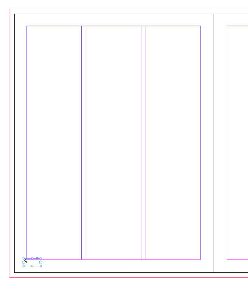
Take the Type Tool (T) and drag to create a small text frame in the far-right bottom corner of the right-hand page of the A-Master spread. Set your type cursor into the frame and head up to Type > Insert Special Character > Markers > Current Page Number. 
current page number
InDesign will drop an ‘A’ character into the frame, which you can format with your own choice of font, color and size using either the Character Formatting Controls panel at the top of the workspace or the Character panel (Window > Type & Tables > Character). 
InDesign will adapt the ‘A’ to the page number of any page in your document which has the A-Master applied to it. 
number
Select the page number text frame and Edit > Copy, Edit > Paste. Move into a mirrored position at the bottom-left corner of the left-hand page, and adjust the text to Align Left.
number pasted
Take the Type Tool (T) again and create a longer text frame across the top left corner of the left-hand page. Type in ‘MAGAZINE NAME’ and, as before, adjust the formatting until you’re happy with the result. 
Then Edit > Copy, Edit > Paste the text frame, moving over to the right page, and adjust the text to read ‘ISSUE NO. MONTH’. Adjust the text to Align Right. 
align right text
When you start designing your magazine, you can easily head back into the A-Master and adjust these to adapt to the magazine title, issue number, and date. 
Select the Type Tool (T) and drag onto the left-hand page, creating a text frame that fits neatly within the first column. Allow the top of the text frame to sit a bit below the magazine title text frame, and the bottom to sit a bit above the page number text frame. 
Select the text frame and Copy and Paste it repeatedly, moving a new text frame into each column. 
Finally, hover over the bottom-right corner of the first text frame, and click on the blank white square you can find there. A chain link symbol will appear next to your cursor. Click into the next column along, linking the first text frame to the second. Repeat until all the columns are linked in a sequence. 
linked text frames
This means that when you have a full page of text in your magazine, you can simply Place or Paste text directly into the column structure, and the text will flow automatically throughout the column sequence. This is a neat little timesaver when putting together long magazine layouts.
Not every page of your magazine layout needs to feature page numbers, and indeed sometimes the opening pages of features or articles look better without page numbers. For this, we can create a new master.
Select the A-Master page icon in the Pages panel and choose Duplicate Master Spread “A-Master - Inside Spread”. This will create a new B-Master.
duplicate master
Select the B-Master icon, and choose Master Options for B-Master from the menu.
master options
Rename the master ‘Master - Article Opening Spread’ and click OK.
opening spread
Double-click the B-Master icon to open it up on screen. You can edit this spread to better suit the opening spread of a feature. Say, for example, you wanted to use a full-size picture across the spread to announce the start of an article. You wouldn’t need text frames for this sort of layout, so you can select the text frames in the columns and delete them.
You might also want to get rid of page numbers, by selecting these text frames and deleting them. 
delete numbers
You can also select the running header text frame and reduce the Tint of their color to make them more subtle. You can do this directly from the Swatches panel (Window > Color > Swatches) by pulling the slider at the top-right of the panel to the left.
swatch tint
To apply this B-Master to the opening pages of your articles, you simply need to click and drag the B-Master page icon down onto your chosen page in the Pages panel. 
Most long documents, such as books and magazines, will benefit from being divided into sections. For magazines, you can create a very simple sectioned structure, with page numbers throughout only the main bulk of the magazine and a short section without page numbers at the start. Many magazines fill their first few pages with adverts, a contents page and sometimes an editor’s letter, and there’s often no need for these to be numbered.
Let’s say, as an example, that you want to start the actual content of your magazine on the fifth page of your layout. You can always edit the sections later to make the numbered pages start earlier or later.
Remaining in your inside pages template, click onto Page 5 in the Pages panel to highlight it. From the panel’s drop-down menu, choose Numbering & Section Options.
numbering options
In the New Section window that opens, check the bullet next to Start Page Numbering at: and keep the number set to 1.
Under Style, choose 1, 2, 3, 4... from the drop-down menu.
new section
Then click OK. InDesign will flag up a warning that you have duplicates of some page numbers (1-4) in your document, but that’s not a problem for our purposes here, so go ahead and click OK
warning
Now you’ll see in the Pages panel that Page 5 is now Page 1, marking the start of a new section. The page numbers on the pages themselves will also reflect this change.
new section
Now you can get rid of the visible page numbers on the first section of your magazine, by either removing the A-Master from pages 1-4 (to do this, drag down the [None] page icon at the top of the Pages panel onto each of these pages) or applying a different master without page numbers. 
master applied
I’ve done the latter here, dragging down the B-Master page icons onto pages 1-4, allowing me to keep the running headers but removing the visible page numbers.
section start
Now you have a ready-to-save magazine template for both the inside pages and the cover of a magazine. Awesome work! Head up to File > Save As, and save each separate template in a folder you can easily come back to. 
When you come to work on a magazine design, File > Open the template in InDesign, and File > Save As the document straight away with a new file name, corresponding to the specific magazine you are creating.
magazine template
Now that you’ve laid down the groundwork for your magazine, including setting up the correct page sizes, margins, custom masters, running headers, page numbers and sections, you’re ready to dive straight in to designing. Get some more ideas about how to lay out your magazine with these tips and tutorials:

Create a Cool Typographic Poster Ready for Spirit Day in Adobe InDesign!


Final product image
What You'll Be Creating
Held on 15 October, Spirit Day is an opportunity for people across the world to show their support for LGBT youth and take a stand against bullying. 
You can show your support by wearing purple, and taking a purple selfie! Upload your photo to Twitter or Instagram and tag your post with #spiritday and #envato. It’s as simple as that to show your support!
In celebration of Spirit Day we’ve put together this tutorial for you to create a cool typographic poster ready for printing and putting up in your home or office, to remind your friends and colleagues to take their own selfies of support as well. You can also download two versions of the completed poster to refer to and use! Simply download the attachment for this tutorial.
final poster design
To create your own poster from scratch, you'll need access to Adobe InDesign, and the tutorial is suitable for beginner-to-intermediate users of the software. #SpiritDay!
If you have a long message to get across, typographic poster designs are a fantastic way of making a lot of information look attractive, punchy and memorable. 
We’ll be setting up the poster at A3 size, which is a standard print size, easy for printing off on an office printer. But if you’d prefer a different size, you can simply scale up or down the final poster design when you come to export it as a PDF (see final step of the tutorial).
Get InDesign opened up, and choose Document from the Create New menu in theWelcome window. Or go to File > New > Document. 
In the New Document window that opens, set the Intent to Print.
Keep the Number of Pages as just 1, and uncheck the Facing Pages box.
From the Page Size drop-down menu choose A3 (or set the Width to 297 mm andHeight to 420 mm). 
page size
Increase the Margins on all sides to 25 mm, and then set the Bleed (click More Options if you can’t see the Bleed and Slug settings) to 3 mm on all sides.
margins and bleed
Click OK to create your new document.
new document created
The best way to approach a typographic poster is to divide your page into rows, which allows you to structure your text content. 
The full text for our poster will have about 30 words, which will need to be divided relatively evenly across the page.
To create a grid of rows, first make sure your rulers are visible (View > Show Rulers). From the top ruler, click and drag down a horizontal guide to Y position 51.4 mm
guide on page
To make sure your guide is perfectly placed, you can select the guide with your mouse, and type in the Y position value at the top left of the workspace.
specified guide
Repeat the process from the previous step, dragging down more guides from the top ruler to the following Y positions:
  • 70 mm
  • 96 mm
  • 122 mm
  • 153.6 mm
  • 183.5 mm
  • 205 mm
  • 245.3 mm
  • 274 mm
  • 301.5 mm
  • 321.5 mm
  • 337 mm
  • 358.1 mm
Eventually, you’ll have a striped page, with 13 guides marking out irregular sized rows.
page with guides
How can you make typographic posters look hip and modern, not cluttered and outdated? The key lies in your choice of typefaces. 
A varied mix of font styles, from classic serifs to novelty scripts, looks great paired together, particularly when you anchor the typography with solid, modern sans serifs.
For this poster, we’ll be using the fonts listed below. For future typographic projects, try and find a variety of fonts that fit within similar categories to create that perfect eclectic look.
Download and Install the following free fonts (you may find some, like Adobe Caslon Pro, are already installed in your InDesign font list):
cabin
pacifico
densia sans
symbol font veneer
Before you begin to typeset your poster, you can create a purple color palette, which you can use across the design.
Return to InDesign and your document. Expand the Swatches panel (Window > Color > Swatches).
Select the default [Black] swatch, and then choose New Color Swatch from the panel’s drop-down menu (accessible at the top-right corner of the panel).
new color swatch
Uncheck the Name with Color Value box and rename the swatch as Spirit Day Purple. Keep the Type as Process and the Mode as CMYK.
Set the CMYK values to C=81 M=99 Y=25 K=16, and click Add and then OK.
purple swatch
Repeat the process, creating a second new CMYK swatch, with the values C=86 M=100 Y=31 K=26. Name the swatch Spirit Day Dark Purple.
dark purple swatch
Click Add and OK, to return to the Swatches panel.
swatches panel
The best way to approach a typographic design is to start at the top and work your way down. Take your text in sections and design one section at a time.
final poster design
So, our first phrase is ‘Take a Stand Against Bullying’. We can add this as one whole design at the top of the page.
Go to the Tools panel at the left side of the workspace and select the Type Tool (T).
Zoom in on the top-left corner of the page, and drag your type cursor onto the page to create a text frame about 108 mm in Width and 59 mm in Height. Sit the bottom of the text frame on the second guide down the page (at 70 mm).
Type ‘Take a’ and, from the Character Formatting Controls panel running along the top of the workspace, set the Font to Antonio Regular, Size 145 pt, All Capsand reduce the Tracking (space between the characters) to -30.
Place your cursor to the left of the final ‘a’ and reduce the Kerning to -60 to pull the‘a’ in closer to ‘Take’.
antonio font
Set the Font Color to Spirit Day Purple, either from the Swatches panel or from the controls panel at the top of the workspace. Reduce the Tint of the color to 65%by pulling the Tint slider to the left.
tint of swatch color
To the right of ‘Take’, create a new text frame using the Type Tool (T) and position it in the top-right corner of the page. 
Type ‘Stand’ and set the Font to Nexa Rust Sans Black, Size 100 pt, Tracking to30 and Font Color to Spirit Day Purple with an 85% Tint.
Make sure the baseline of the text sits on the top guide, at 51.4 mm.
stand slab text
Beneath ‘Take a’, create another text frame, and type ‘Against’ into the frame. Set the Font to Picadilly Regular, Size 66 pt, All Caps, Tracking -10 and Color toSpirit Day Purple with a 65% Tint.
picadilly font applied
In the remaining space, below ‘Stand’, create another text frame and type ‘Bullying’. Let the text fill the space by setting the text in a tall, thin font like Densia Sans Regular. Set the Font Size to 121 pt, All Caps, and the Color to Spirit Day Purple, Tint 75%.
bullying text
Cap off the first phrase of your poster with a line, underlining the standout word of the phrase, ‘Stand’. 
Choose the Line Tool (\), and, holding Shift, drag from left to right onto the page, under the word ‘Stand’.
Open the Stroke panel (Window > Stroke) and, with the line selected, increase theWeight of the stroke to 1.5 mm and choose Dashed (3 and 2) as the Stroke Type. Set the Color of the line to Spirit Day Purple, Tint 70%.
dashed stroke
Now you have a completed first section on your poster. Great work! 
competed first phrase
We’re going to continue building up the typography in manageable chunks like this. This will also help the reader to digest the information in easy-to-read sections. We’re also going to help the reader by pulling out particularly important words in large sizes and darker purples.
Let’s keep going, and put together the next section down, which is going to read ‘and Take a Selfie’.
Below ‘Against’ take the Type Tool (T) and create a square text frame to the left side of the page. 
Type in an ampersand, ‘&’, and set the Font to Adobe Caslon Pro Italic, Size 210 pt. Caslon has a lovely, decorative ampersand which is going to bring a bit of interest to the poster. 
Set the Font Color of the ampersand to Spirit Day Purple, 75% Tint.
ampersand in caslon
Move over to the right side of the page, adjacent to the ampersand. 
Create a larger text frame that’s about 92 mm in Height and 133 m in Width. Type‘Selfie’ and set the Font to Pacifico Regular, Size 149 pt, and Color to Spirit Day Purple, Tint 95%.
Place the baseline of the word ‘Selfie’ on the guide that sits at 153.6 mm.
selfie text
Fill in the gap between ‘&’ and ‘Selfie’ with ‘take a’, set in Adobe Caslon Pro Italic, Size 66 pt, in Spirit Day Purple 60%, as shown below.
And below that, create another text frame. Open up the Glyphs panel (Window > Type & Tables > Glyphs) and, setting your type cursor in the text frame, set theFont to Nexa Rust Extras. Choose the right-pointing hand from the selection of glyphs in the panel, and double-click to insert. Increase the Font Size to 200 pt and change the Color to Spirit Day Purple 70%.
glyphs panel
Fantastic! That’s another section done.
completed phrase
Move down the page. The next phrase will be ‘in your Purple Outfit’.
Group ‘in your’ together and set them in Lovato Light, Size 54 pt. Pull the Spirit Day Purple Tint down to 80%.
Set ‘Purple’ below ‘in your’ in a bolder Font, League Spartan Bold, All Caps, and set the Size to 51 pt. Increase the Spirit Day Purple Tint to 90% to make it stand out and look stronger.
Set ‘Outfit’ to the right of the page, in a large fuzzy Font like Alpha Echo, Size 142 pt, All Caps, and make the text tighter by reducing the Tracking to -40. Set theColor to Spirit Day Purple, Tint 75%.
outfit fuzzy text
Continue to move down the page. Create a large square text frame, and set theFont to Veneer Extras, Size 340 pt. Have your Glyphs panel open (Window > Type & Tables > Glyphs) and choose the left-pointing arrow from the selection of glyphs available. Set the Color to Spirit Day Purple, Tint 70%.
To rotate the text frame so the arrow points upwards, take your Selection Tool (V, Escape) and select the frame. Then Control-Click (Mac OS) or Right-Click (Windows) > Transform > Rotate 90 Degrees CCW.
Position so the arrow fits snugly to the left of the page, within the margin.
arrow glyph rotated
To the right of the arrow, create another text frame and type ‘Upload’. Set the Font toDigital Dream, Size 80 pt, and increase the Tracking to 20. Set the Color to Spirit Day Purple, Tint 85%.
digital dreams font
Complete this section of the poster with ‘your photo’ set in Great Vibes, Size 110 pt;‘to’ set in Nexa Rust Sans Black, Size 65 pt‘Twitter’ set in Picadilly Bold, Size 33 pt (and rotated CW); and finally a cute little bird glyph picked from the Veneer Extra selection and sized at 148 pt. 
bird glyph
Set the Color of all the text to Spirit Day Purple, and vary the Tint a little to give a bit of variety.
final section
The final section of the text instruction on the poster will read ‘or Instagram with #spiritday #envato’. We’ll continue to use the guides we placed earlier as guides for placing the section of text.
Set ‘or’ at small size and in Adobe Caslon Pro Italic. Set ‘Instagram’ in Lobster Regular, Size 89 pt, and Color to Spirit Day Purple, Tint 85%. 
Place a cloud glyph taken from Veneer Extras, at Size 95 pt, in a small text frame above ‘Instagram’. 
glyphs panel
Set ‘with’ in Densia Sans, Size 51 pt, Tracking 70, All Caps, and rotated90 Degrees CW, and position it in the center of the page.
To the right of ‘with’, set ‘#spiritday’ and ‘#envato’ in Cabin SemiBold and play around with the sizes to get them to fit snugly in the available space to the right side of the page. Make the color nice and strong, Spirit Day Purple, Tint 95%.
final section
The main part of your poster is finished, great work. All that’s left to do is create a main ‘Spirit Day’ title for the poster, which we’ve made room for at the bottom of the page.
Take the Line Tool (\) and, holding Shift, drag across the page to create a line246 mm in Length. Sit the line on the 337 mm guide.
Expand the Stroke panel (Window > Stroke) and adjust the Weight of the stroke to2 mm and the Type to Dotted. Set the Color of the stroke, from the Swatchespanel, to Spirit Day Purple, Tint 85%.
dotted stroke
The Spirit Day branding is clean and modern, so a simple serif font is going to look great for the main ‘Spirit Day’ heading. 
First up, take the Type Tool (T) and create a square text frame, positioning it below the dotted line in the bottom-left corner of the page. Type ‘#’ and set the Font toCabin SemiBold, Size 115 pt, and set the Color to Spirit Day Dark Purple. Don’t apply a Tint this time—keep the color strong.
hashtag text frame
Select the hashtag symbol text frame and Edit > Copy, Edit > Paste
Move the pasted text frame to the right of the hashtag, and pull across to extend its width. 
Adjust the text to read ‘SpiritDay’, and set the text in All Caps. Increase theTracking to 70. Allow the edge of the ‘Y’ to sit against the right-hand margin.
Ensure the baseline of the text is sitting on the bottom margin.
completed heading
dark purple swatch
Add a little subtitle above the ‘#SPIRITDAY’ main heading, that reads ‘Show your Support on October 15th. Set the text in Cabin, All Caps, Size 30 pt, Tracking 30and Color to Spirit Day Purple, Tint 60%.
sub-heading
Flank either side of the subheading with little left- and right-pointing arrow glyphs taken from the Veneer Extras selection in the Glyphs panel.
glyphs panel
glyphs panel
Congratulations! Your Spirit Day poster is finished, and it’s looking great. Now all you have to do is export it to a print-ready format, ready for printing professionally or printing at home or in the office.
First up, File > Save As your poster to make sure you have a saved copy of your InDesign file.
Then go to File > Export. In the Export window give the file a name, such as ‘Spirit Day Poster for Print’, and choose Adobe PDF (Print) from the Format drop-down menu. Click Save.
export window
In the Export to Adobe PDF window that opens, choose [Press Quality] from theAdobe PDF Preset drop-down menu.
press quality
From the Marks and Bleeds menu option (accessible from the left-hand side of the window), either leave these options blank if you’re going to be printing your poster at home or at the office, or select Crop Marks and Bleed Marks, as well as Use Document Bleed Settings, if you want to send your poster for professional printing.
crop marks and bleed
Click Export to create your print-ready PDF file.
Here you can see I’ve also created a version of the poster with a purple background—you can get your hands on a purple version too by downloading the InDesign file attached to this tutorial.
exported poster
Awesome work guys! Your typographic poster is finished and ready for printing, and it’s going to be a great way of getting people involved in Spirit Day on 15 October.
final poster design
In this tutorial we’ve covered a number of useful skills for creating typographic poster designs. Here are just a few of the key skills you’ve picked up, which you can make good use of for future projects:
  • How to split a poster layout into rows, ready for sectioning up large pieces of text into manageable chunks
  • How to choose a varied selection of typefaces to create a cool, eclectic type look
  • How to apply a simple two-color palette and vary the result with tints to create a uniform, minimal design
  • How to export your poster designs ready for in-house or professional printing
Give yourself a big clap on the back! Feel free to share your own Spirit Day or other typographic poster designs in the comments below. We’d love to see them!
poster mock-ups


Copyright @ 2013 KrobKnea.

Designed by Next Learn | My partner